Hi, I’m Alice and I
visualize data.
I also design and build web interfaces and user experiences.
ACLED
conflict explorer.
Visualising conflicts around the world by showing event frequency, fatalities and population exposure in one combined exploratory data display.
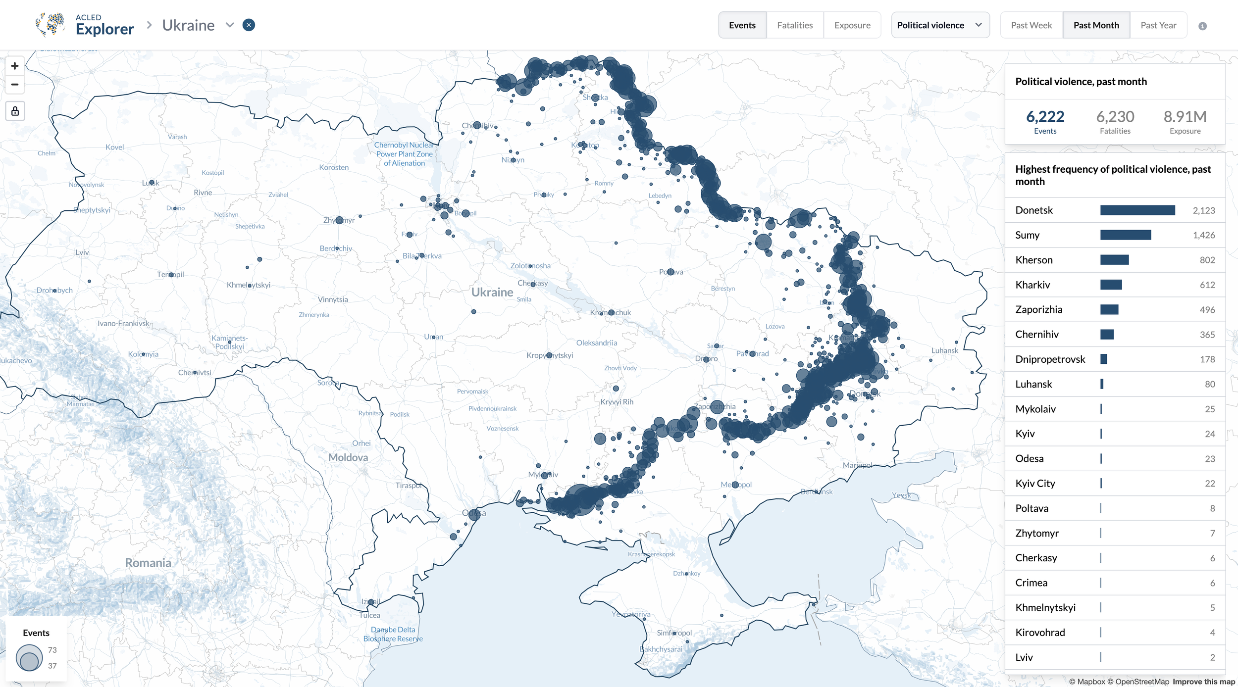
Art Direction, Visualisation- UX & UI Design, Development
more details coming soon…
STRATEGIC PERSPECTIVES
gas insight.
Visualising different scenarios to transition from fossil fuels to cleaner, renewable energy sources

Creative Direction, Visualisation UX & UI Design, Development
WORLD BANK
sdg atlas 2023.
Visualising progress toward the Sustainable Development Goals of the United Nations
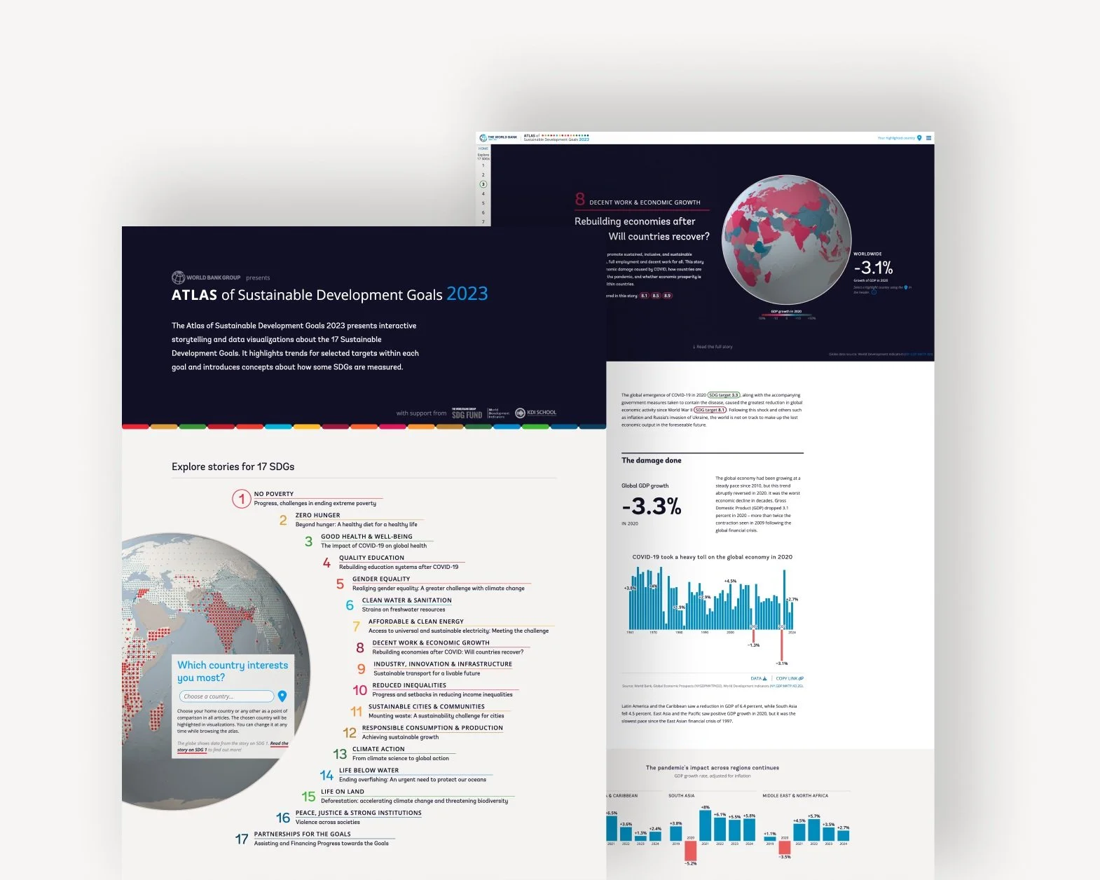
Art Direction, Visualisation- UX & UI Design, Development
WHO
data design language.
Creating a recognisable data design language that shows global health data in a clear, transparent, open and robust way.
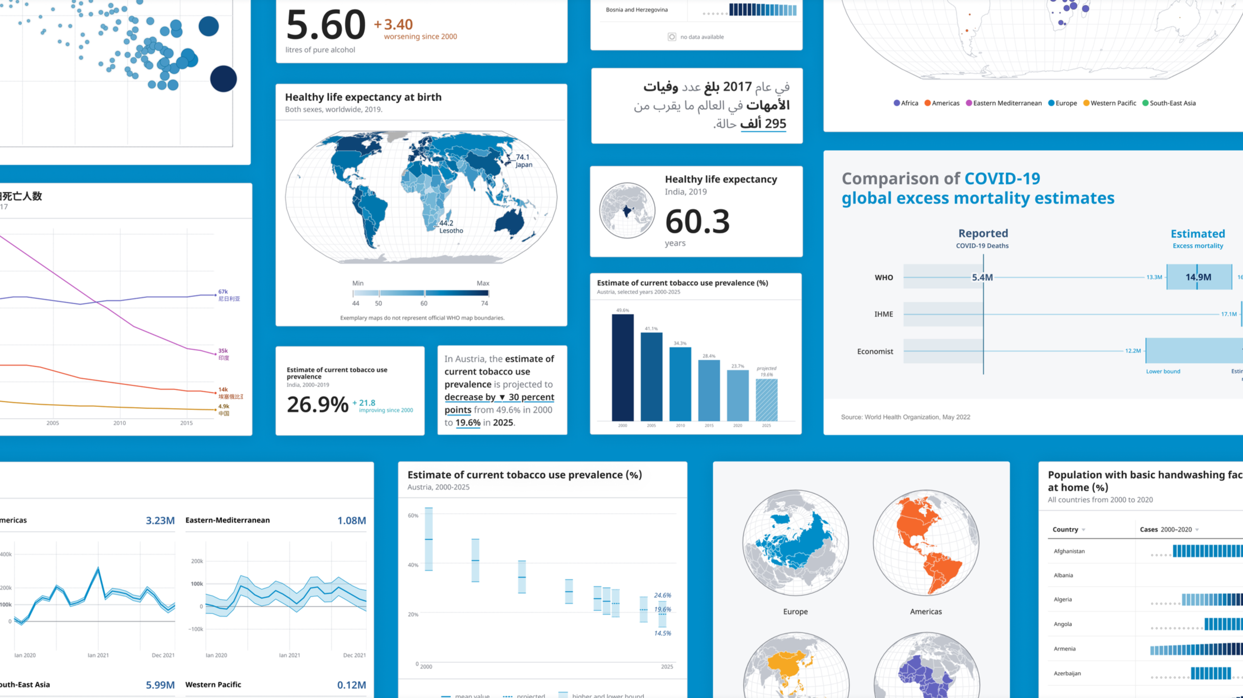
Visualisation Design for Kore and Truth & Beauty
services.
visualization design
My approach to data visualization is backed by the latest research in the field and is led by empathy for the people who interact with data on a daily basis. I can help you get your data into the right shape to make it visual, understandable and beautiful.
interface & ux design
I create websites and applications that people enjoy using, whether it is for work, for fun or for learning something about the world. My background in Design and UX allows me to design experiences that create joy, both visually and by making them easy to use.
user research
My experience in academia and as a Senior User Researcher has taught me how to help you understand the people who used your tools. I always put the human at the center of the design process, through an empathetic approach as well as scientific study methods.
clients.


“We are delighted with the two tools developed for us by Alice. The results are really quite engaging, and I believe set a standard for the field on how tools and platforms with layers of complex information are best developed.”
- Clionadh Raleigh, CEO of ACLED
awards.
-
The SDG Atlas 2023 received this most coveted award at the Information is Beautiful Awards of the Data Visualization Society. This recognition is received by only one submission across all categories.
-
The SDG Atlas 2023 received Gold at the Data Visualization Society’s Information is Beautiful Awards in the Humanitarian Category.
-
My Ph.D. thesis received an honorable mention at the VGTC Best Dissertation Award, honoring the best theses in the field of data visualization.
-
I received an honorable mention at the Kantar Information is Beautiful Awards in 2017 for my data pottery project Life in Clay.