
Suchströme
Art Direction, Visualization & UI Design
Visualizing Google Search Interest in the German Election Year 2021
What do people in Germany google in the super election year 2021? How does the interest in relevant political topics and parties change over time? And, how does the interest in different topics compare?
Collaborators & Client
Creative Direction:
Moritz Stefaner
Code:
Matthias Stahl
Google News Initiative Team:
Isa Sonnenfeld
Leslie Leuenberger
Simon Rogers
Alberto Cairo


The project Suchströme (=search streams) reveals the top search trends on Google related to the German election 2021. In a series of interactive graphics, people can explore and compare the search interest in Germany’s major parties and current political topics.
When we started out with this project, Moritz Stefaner and I, as well as the team at Google New Initiative all agreed that we want the project to focus on political interest. Moritz has already worked on two visualizations of Google search data related to elections: One for the German election 2017 (2Q17) and one for the US election 2020 (Waves of Interest). 2Q17 focusses on real-time searches and attention peaks related to the top candidates. Waves of Interest looks at more long-term and geographical patterns in political topics over several election cycles.
We drew influences from both of these projects. Focussing less on real-time data and more on political topics allowed us to see trends in the search interest in the last 12 months.
We further decided to show interest in the six major parties to clearly relate the project to the upcoming election, while steering clear of the gossip that can sometimes dominate the interest in relation to the top candidates.
On this basis, the core idea of the project quickly emerged: Let’s focus on direct comparisons to convey the excitement of a race between parties and political topics. What generates more interest in Germany, COVID-19 or sustainability, racism or unemployment? Which party is searched for more, the Green party or the CDU?

Design of the Key Visual
The key visual I developed puts direct comparisons front and center. Two lines each show the interest in a topic over 12 months. The visual focus lies on the filled areas between the curves. They show the difference between the topics and are colored to reflect which topic is in the lead. This highlights the differences within the direct comparison, while still allowing the viewer to see the individual developments of each topic.
Different types of comparisons
We originally started out using the concept of the key visual for the comparison of political topics and parties. However, the simple focus on comparisons can also be extended to all kind of comparisons.
On the page, we included temporal comparisons, showing the same party over the last two election years 2017 and 2021. This allowed us to explore questions like: How did the search interest in the major parties change compared to the last election? Who wins and who loses interest?
For each comparison featured on the page, we also included downloads for sharing on social media, as images or video.
-
Comparison of two parties
-
Comparison on the last two election years

-
Comparison of two topics

Inspiration & Design Process
For design of the key visual and the texture on the page, I drew inspiration from different sources.
-

William Playfair's Imports & Exports
The key visual used in Suchströme was first used by William Playfair in 1786. He already recognized the power of this technique for highlighting differences in 1-to-1 comparisons.
-

Calder's Mobiles
The shapes of Calder’s Mobiles were an also inspired the aesthetics of the visual. We wanted to create shapes of similar smoothness & roundness in our visualizations. (Photograph © Andrew Dunn, 5 September 2004.)
-

Meandering Rivers
The visual overlap and metaphor of meandering rivers (as seen in this 1944 graphic by Harold Fisk) inspired the design and also gave the project its name (Suchströme = Search Streams).
-

Printing Techniques
We also drew inspiration from the look of different printing techniques. Specifically, the overlaps that emerge in cyanotype prints influenced the design. We further imitated grain in risographs to give the visuals some grit.

Initial Sketches & Ideas
We played around with several ideas before landing on the key visual. One concept we had to abandon, was the comparison of different combinations of terms. For example: Was the term climate searched more in combination with the Green Party or the CDU? For these types of comparisons, the data was simply not saturated enough to be rendered in a meaningful way.
Design & Concept Exploration
-

Rising & Falling Terms
Comparing Search interest to multiple previous election years, showing past years as fading lines to quickly see if a topic is gaining or losing popularity.
-

Comparison to Election Polls
Another visual I played with uses triangles to show comparisons. Here, the two perpendicular axes show search interest and election polls. The shape of the triangle makes it possible to gage whether a party is represented more strongly in people’s search interest or in polls. However, it avoids direct comparisons of two dimensions that are measured quite differently.
-

Geographical Comparisons
This concept already comes close to the concept we realized. Although geographical comparisons were not featured in the final page, the key visual originally stemmed from the idea of comparing a term along different meta-data dimensions of the searches.
-

Grid of Temporal Comparisons by Topic
We also experimented with several grid views, where multiple comparisons could be viewed at the same time. Here you can see a display of different topics with each card showing a comparison of the last 2 election years.
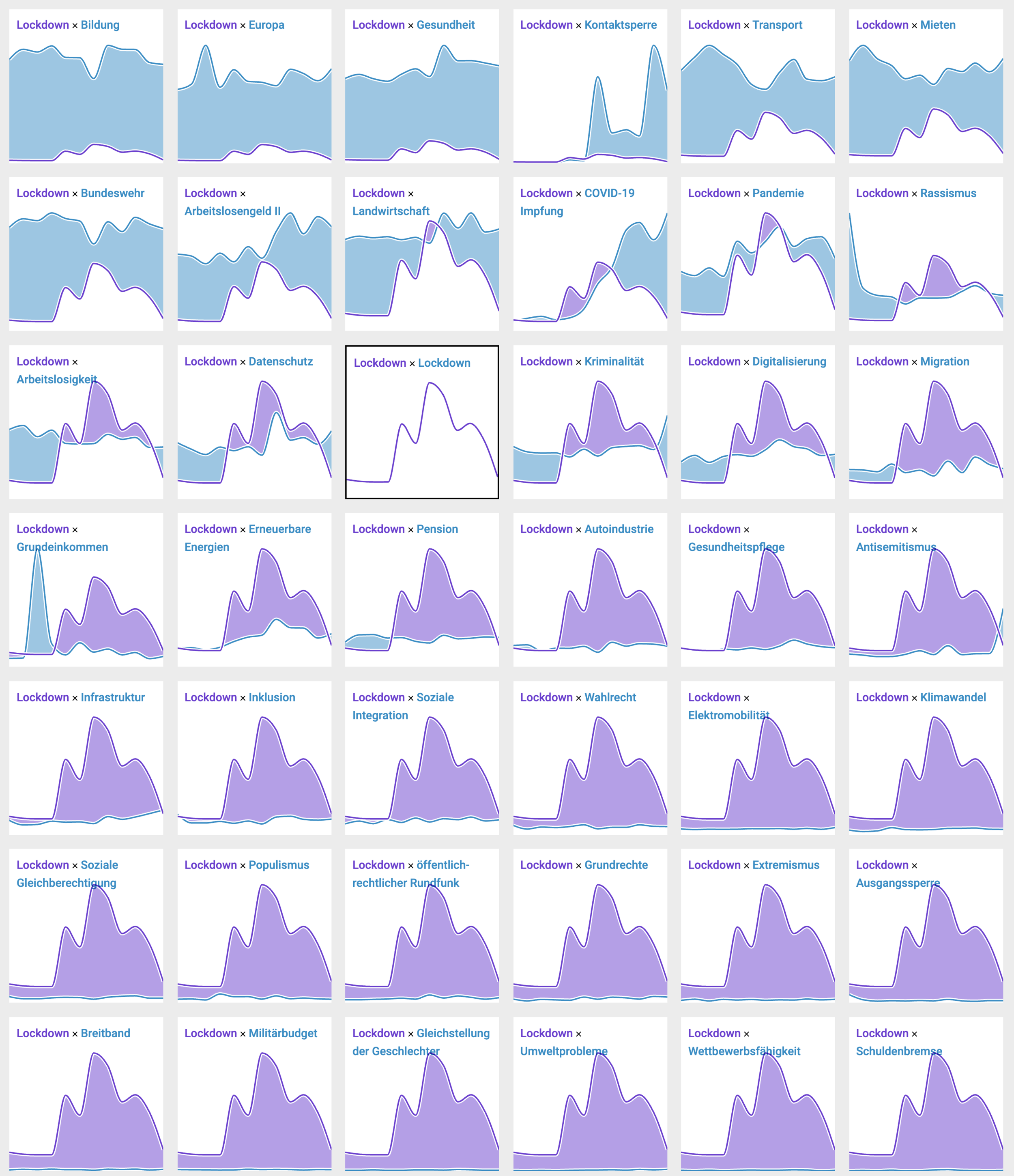
Exploring the data and finding interesting comparisons
Although we did not end up using the grid view in the final product, it proved very useful in exploring the data and finding interesting comparisons to feature on the page of explore the trends of individual topics in general. Here, you can see the topic Lockdown compared to all other topics. The topics are ordered by interest, so we can see visual patterns emerge from top (more blue = other topic is more popular) to bottom (more purple = Lockdown is more popular). The closest races, that also produce the most interesting visuals, are usually found close to the selected topic. The grid can easily be explored by clicking on another card to change the topic in focus.
What did we learn?
Some trends we also saw in the media are reflected very clearly in the search interest. For example, the Green Party has gained immensely in interest this year.
However, for some parties, the search interest is pretty high in relation to their actual election results. The AfD for instance is still searched for the most, despite losing votes.
Although the FDP has improved their election result compared to the previous election, their search interest still remains low compared to other parties.
Looking at COVID related topics, people have lost interest in Lockdowns compared to the beginning of the year, while the interest in vaccines has surged.
When it comes to new technologies, Artificial Intelligence is very a popular search term. It is searched for almost as much as COVID-19 vaccination and is even more popular than Data Security.
Despite being a topic that is increasingly discussed in the media, climate is still not very much in the focus when it comes to people’s search interest. The topic Climate Change was only on the 29th place among the political topics we chose for Suchströme.
However, Sustainability or Renewable Energy are searched for more often, suggesting that people are more interested in solutions rather than the topics that relate to the problem more broadly such as Climate Change or Environmental Problems.
There is a lot more to explore! Find your own insights on Suchströme!
More about the project
Suchströme was featured on the Google Election Trends Hub as well as on Google Keyword.
Further Media Coverage:
Meedia Article
Heise Article